Step 24: Plot model scores vs. input parameters
Use graphical methods to display model scores (prediction errors, from OrbScore2) as a function of input parameters. I find it convenient to use a spreadsheet to keep track of models, by creating a column for each variable parameter and each score, and a row for each model. Then, the built-in graphical tools can be used to see how one part of the parameter space is favored or rejected.
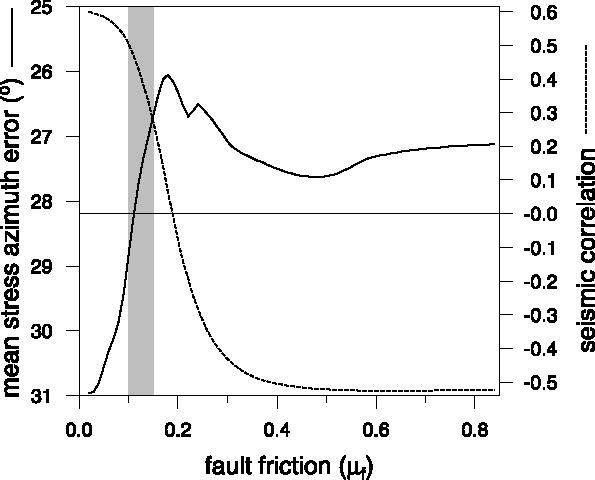
Here is a one-dimensional example, from Jimenez-Munt et al. (2001): A set of models of the Iberian continental margin and Africa/Eurasia plate boundary zone have been computed with different values of fault friction, and scored on their ability to match the seismic strain-rate map ("seismic correlation"; should be high) and horizontal principal stress azimuths ("mean stress azimuth error"; should be low):

In this case, the seismicity test rejects models with fault friction above about 0.15, while the stress test rejects models with fault friction below about 0.10, implying that the best average value for the region is about 0.10 to 0.15.
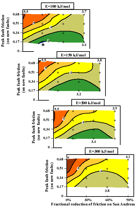
Here is an 3-dimensional example from Bird and Kong (1994)
in which southern California was modeled, with variation of three parameters:
fault friction ("peak fault friction on new faults" = fFric), fault weakening with slip
("fractional reduction of friction on San Andreas" = Byerly), and the activation energy for
dislocation creep in the crust ("E", related to bCreep):

The quantity contoured is a composite prediction error in units of mm/year. The best model is marked by *.