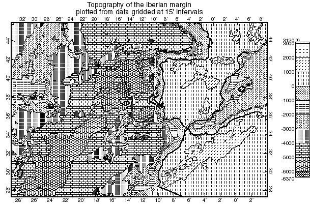
These maps are not very attractive, but they can be practical.
In most traditional print journals, color figures cost the authors a lot more in page charges. If you want to distribute maps by photocopying, you also face a "color barrier" of cost and convenience. Finally, color images are not accessible by the color-blind. So, black & white figures are still sometimes necessary.
Gray-scale maps, or maps with very fine shading patterns, would also look nicer than these high-contrast maps. However, half-tone screening of such figures leads to unpleasant Moire interference patterns, and contrast/exposure problems can lead to unwanted solid black or solid white areas. Even with the best reproduction, it can be very difficult to match the shading patterns on the map to those on the explanation.
Therefore, the high-contrast black & white maps produced by OrbMapAI and FiniteMap use very coarse shading patterns to fill the areas between contours. The line-weight used in each pattern is 0.6 points (0.008", 0.2 mm) which is large enough so that every line can survive multiple reproduction steps. The patterns are distinct enough so that each can be matched to the explanation and read for its numerical value.
Because these maps are created as PostScript .ai files, the contours and patterns can be printed with the highest resolution available on the printer (300, 600, or 1200 dpi). Reproduction as a 28 KB .GIF file (below) does not convey the crispness which is possible. Therefore, you may also want to download the example as a 672 KB .pdf (compressed PostScript file, for Adobe Acrobat) and try zooming in to 800%.